A UI/UX Review of an Armenian Medical Aggregator
In this article, we will do a UI/UX review of doctors.am, an Armenian medical aggregator.
I love checking Armenian websites because Armenia is where I live, and I constantly find interesting examples to review. Many of these sites are good material for showing real UI/UX flaws.
The home page
Here is what it looks like in the English version. I will not pay close attention to the copy because it may have been translated incorrectly. Instead, it gives us a general idea of what the site is and how it is structured.
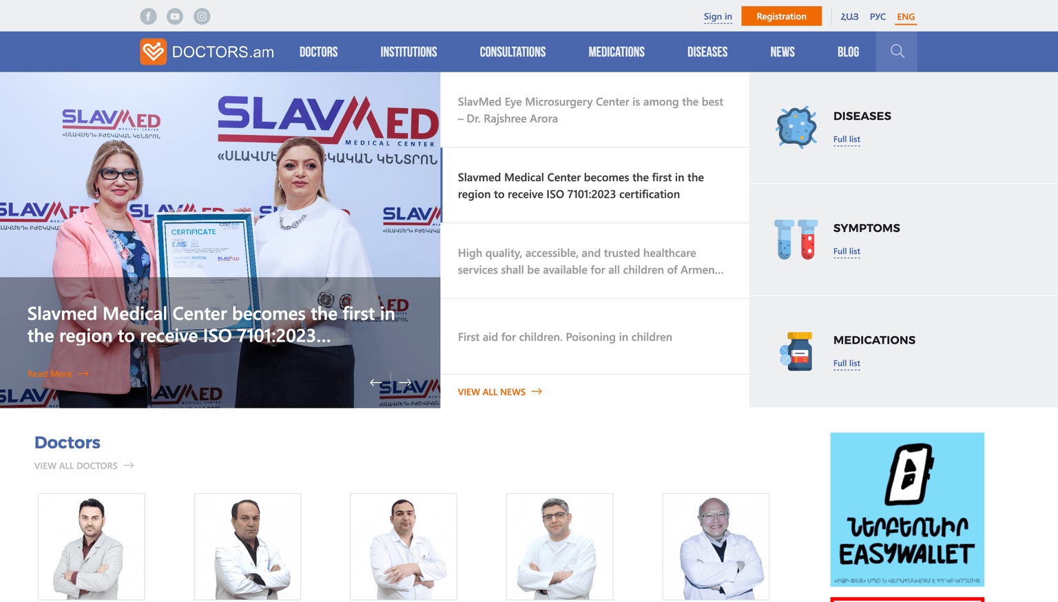
First of all, I would not say this is a typical hero section pattern.
On the one hand, it is not a typical SaaS application where you have a few lines of text with a CTA button. However, it is not a pure news site without any functionality either.
It has at least a database of doctors, diseases, symptoms, medications, consultations, and authentication. Since it is a medical aggregator, I assume the main idea is that users can find a doctor, read reviews, and continue from there.
Diseases, medications, and symptoms are probably secondary. Anyway, it is not visible right away, but there are actually four search inputs. Three of them are hidden.
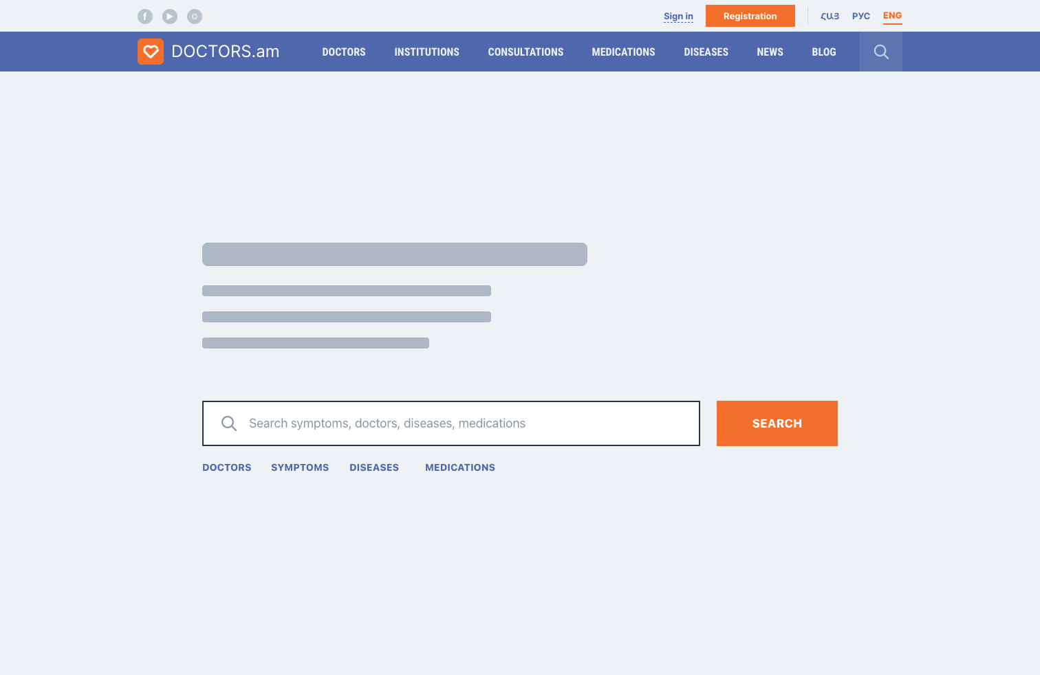
Take a look at what happens when you hover over these three blocks.
It turns out that these search inputs are hidden until you hover over the corresponding section.
So we have two problems at once: hidden inputs and layout shifts on hover.
That is a risky combination for a core interaction. If search is important, users should not have to discover it accidentally.
If my assumption is correct and the core feature is searching for medical information, the hero section could be simplified by having exactly one search input.
Beneath the input, there could be links to the catalogues of doctors, medications, diseases, and so on.
The idea is to:
- Show the search right away.
- Use one input with live search that works for every type of entity.
- Keep links to each catalogue as quick actions, similar to the "full list" links in the original design.
Another possible layout would be a two-column layout that shows both the single search input and, for example, the latest news.
Menu
In the menu, only two items have submenus: Diseases and News.
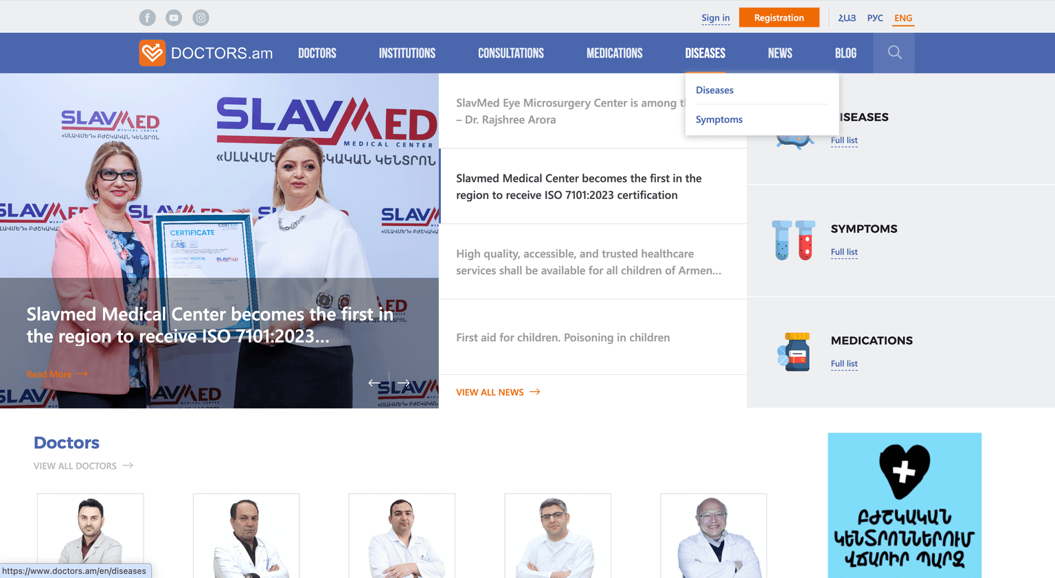
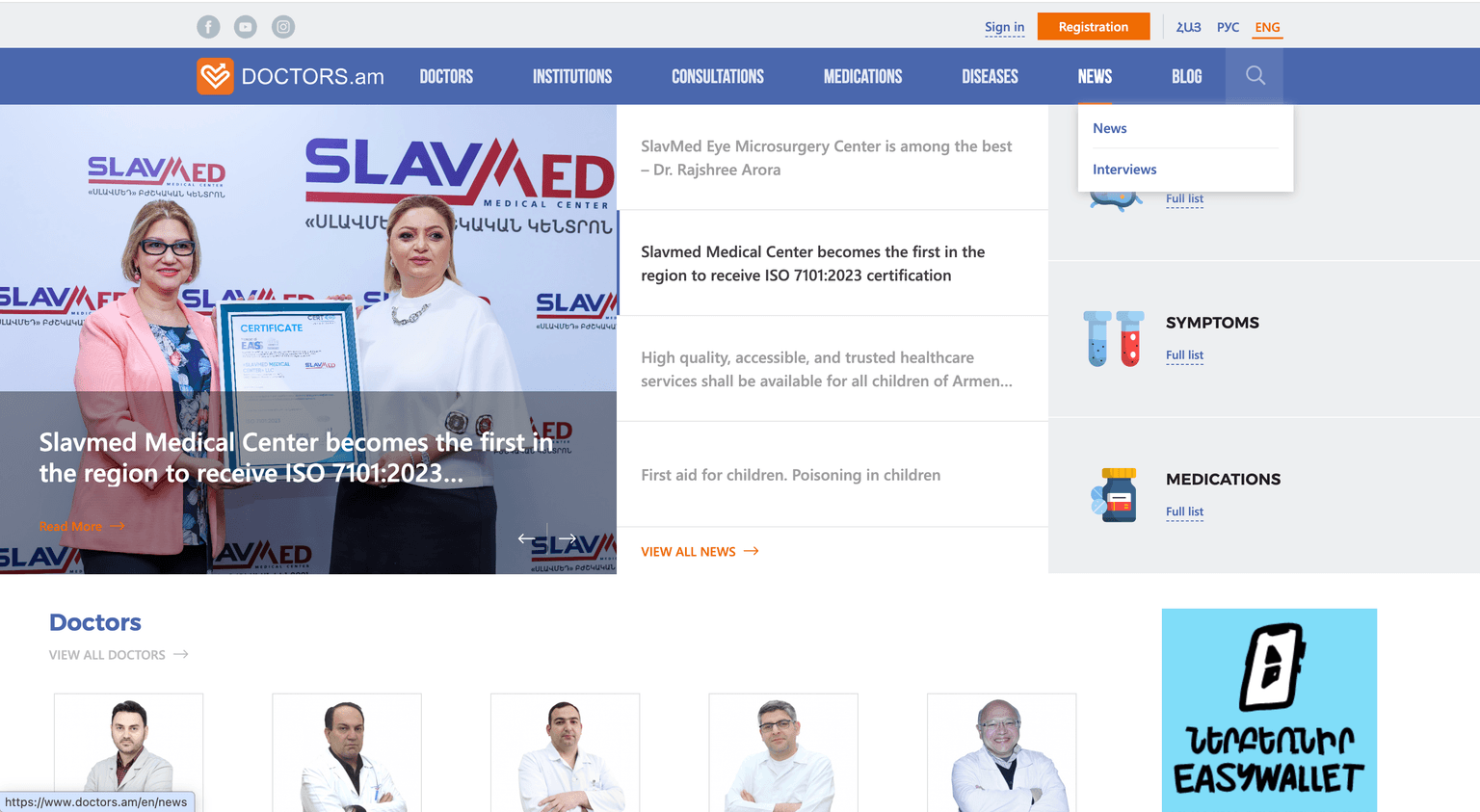
First, users may not realize that these menu items contain sub-items. A dropdown icon would help because it works as an indicator.
Second, the labels themselves suggest that something is wrong with the IA (information architecture). The Diseases menu has two sub-items: Diseases (again) and Symptoms. The News menu has News and Interviews.
Two problems here:
- Duplicate labels.
- Only two links inside each submenu.
At the same time, the logo takes quite a lot of space. There are many ways to structure the header so all these links are shown right away, without dropdown menus.
We literally need to add Symptoms and Interviews to the menu. Nine links in total. Not that much.
I bet if we dig deeper, we will find that News, Blog, and Interviews could be merged. Or at least Blog and News, since it is strange to have two separate content sections. We could use filters after all, depending on what kind of content users want to read.
Registration form
Here we have plenty of things to discuss.
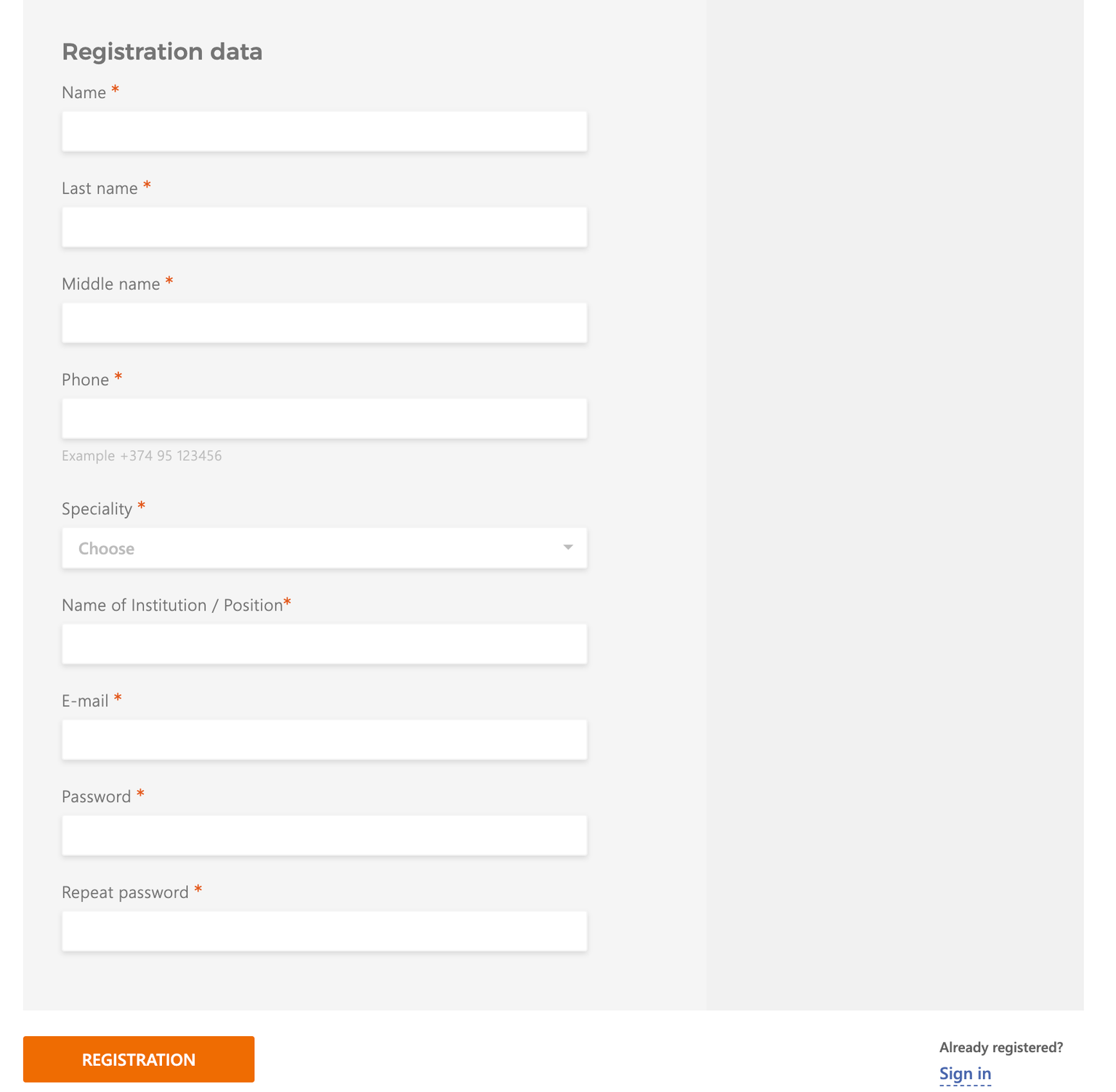
First, I am not sure why the form needs the right-side area with a different shade of gray. It looks like an empty panel and could be removed or simply made white.
Then, if all fields are required, there is no need to put asterisks next to every label. I have already written about whether required fields should be marked, but in this case the asterisks definitely clutter the UI.
There are also many places across the site where the text has very poor contrast. For example, the "Example +374 95 123456" placeholder is barely visible.
By the way, if the product expects a specific phone number format, it could use an input mask. If the format is strict and they accept only Armenian phone numbers starting with +374, a mask would be completely fine.
One-column layout: is it good or not?
I also wanted to talk about the fact that the form uses a one-column layout. If you google form design best practices, you will often find the same advice: use one column rather than two or more. The eye path goes from top to bottom through each input until we reach the submit button.
With two columns, the eye path can start moving in a Z-pattern, which is usually worse.
But it is totally fine to group a few inputs together if they are closely related. For example, first name and last name can sit on the same row. I am not sure why the middle name is required here, since technically a person might not have one.
Here is an example of what I mean. This is my old UI/UX tip.
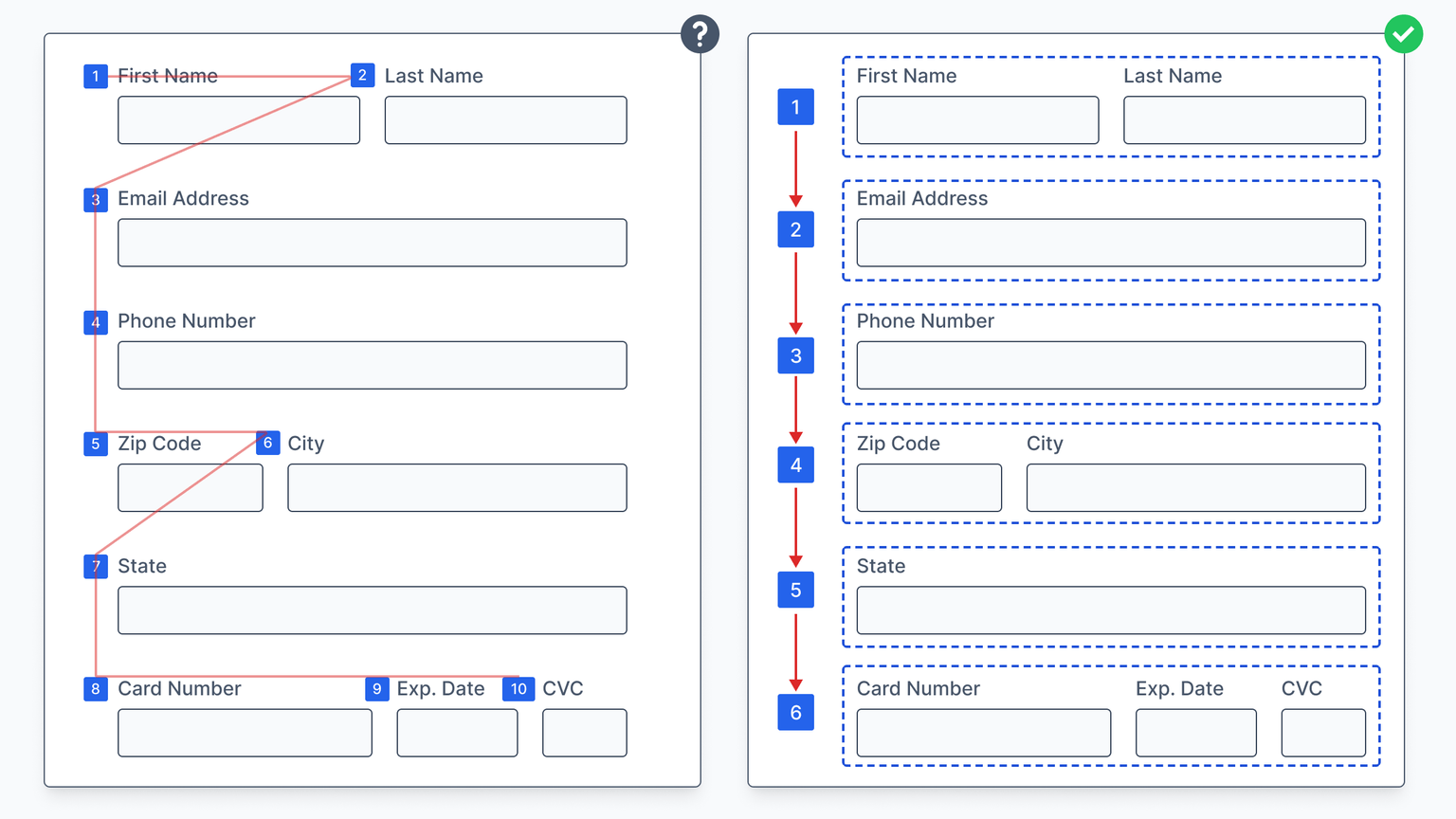
Even though we have two or even three columns on certain rows, it does not mean the whole form should be considered a multi-column layout.
In our case, the only inputs that can probably be combined are the first and last names. The middle name might go on the second row.
However, depending on the overall design and the expected name order, I would even consider putting first name, last name, and middle name in one row if there is a typical sequence for filling them in. For example, in some countries people commonly use "Last Name", "First Name", "Middle Name" in that order.
Grouping data
What else could improve the form? Group related inputs.
For example, the form could have vertical groups such as:
- First name, last name, middle name, and phone number (personal data).
- Specialty and name of institution / position.
- Email and password (auth data).
In contemporary interfaces, these groups could even become three different steps, so we ask only a few questions at a time.
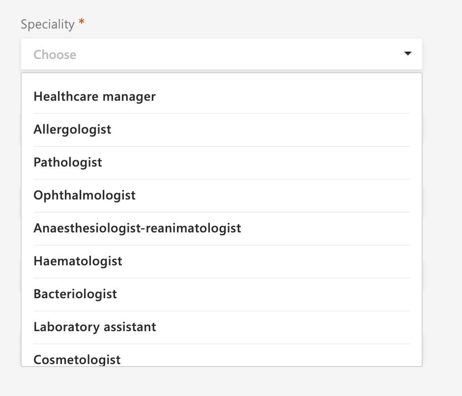
Dropdown search
If you have a dropdown with many items, please provide search. It never hurts.
Tiny useful CSS trick
I remember googling the latest CSS features while writing my book. There was a case where different translations could make some elements fail to adapt to the width of their content.
To fix it, we can use the width: fit-content; property.
The
fit-contentsizing keyword represents an element size that adapts to its content while staying within the limits of its container.