CSS Combo for a11y, performance and browser support
This CSS combo does something most developers skip.
It handles accessibility, performance, and browser support at once.
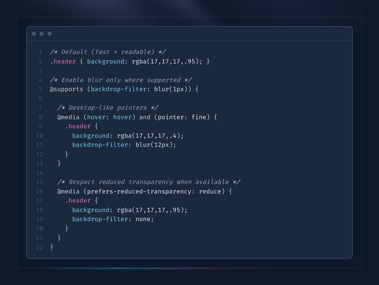
Take backdrop-filter as an example. Users might not want fancy liquid glass effects. Also, backdrop-filter heavily consumes GPU resources because it requires real-time processing of every frame.
What you need to know:
- There is
prefers-reduced-transparencymedia query, indicating whether users have disabled transparency effects in their OS. It has 72.57% global support, not universal, but growing. backdrop-filterhas around 95% browser support. With@supports (backdrop-filter: blur(1px))you can check whether it is supported or not.- With
@media (hover: hover) and (pointer: fine)you can check if we are on a desktop device.
What you can achieve:
- Have a default behavior for something, for example a header with a semi-transparent background.
- If backdrop-filter is supported then you can apply it.
- Apply it only for desktop devices to reduce resource consumption.
- If users do not want it, you can disable it for any kind of device.
You can also flip it around if you want blur only on mobile.
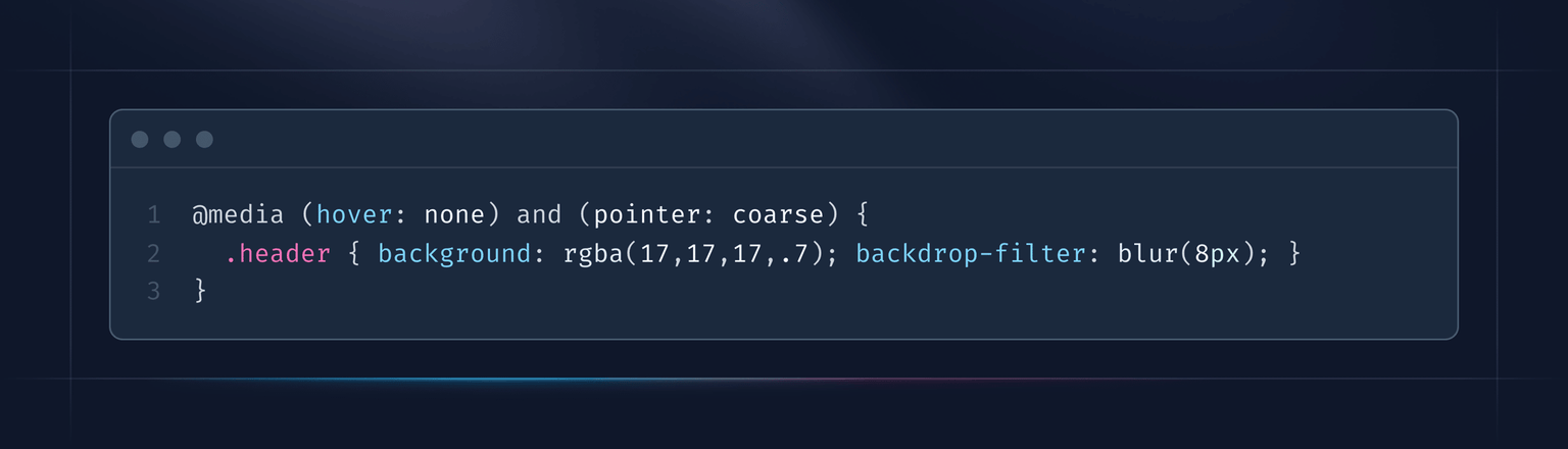
If @media (hover: hover) and (pointer: fine) checks that it is a desktop device, then (hover: none) and (pointer: coarse) checks that it is not a desktop device. It is not 100% accurate, but works well in practice.
P.S. Need some help on UI/UX side? Here is how I can help: vpon.me/consulting
Have a nice week.