Here are 3 quick UX gems for you
I reviewed many short notes and picked three practical solutions that noticeably improve interfaces.
1. Verifying email typos
A great pattern is to detect likely domain typos (for example gmaail vs gmail) and suggest correction.

2. Switches vs segmented buttons
Use switches when:
- The option is binary.
- The action applies immediately.
For alternatives like List/Map, Cash/Card, Delivery/Pickup, segmented controls are often better.
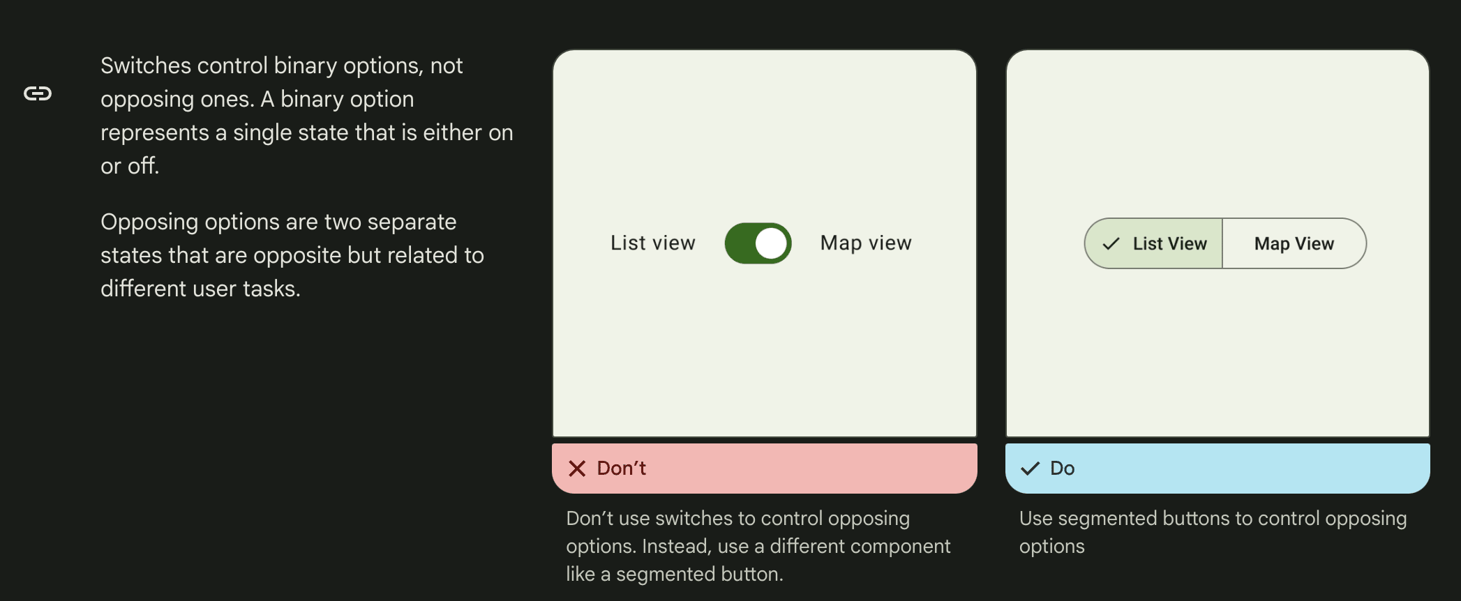


Reference: Segmented controls overview
3. Watch flex-shrink
A common bug: buttons/icons collapse when content grows and flex-shrink is not constrained.

Always test with long content and edge cases.