Reviewing a sign up form
Side note: I've changed my email to hi@vpon.me to match my current domain.
The first newsletter of the year is a bit of a warm-up. I will walk through a sign-up form and point out typical issues that appear in old legacy interfaces.
The goal is to help you recognize these problems quickly when you are working with an existing UI.
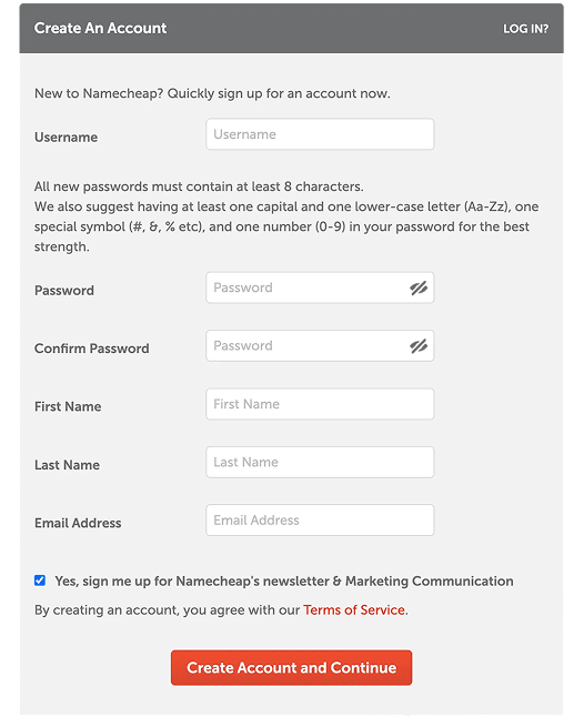
The form
Here is what it looks like. The question is, how many problems can you spot?
Let's take a closer look.
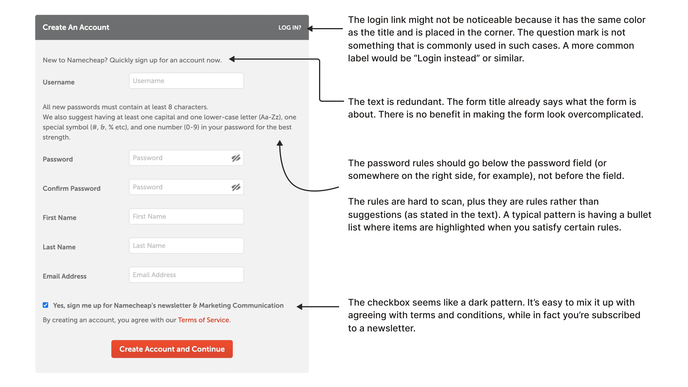
There is a "log in" link. Usually, you would expect it at the top or bottom of the form, maybe near the heading. Here it has the same visual style as the form heading and sits in the top-right corner. Some users will likely miss it.
The question mark in "LOG IN?" also feels odd. A sentence like "Already have an account?" works fine. But when you use action words like log in, sign up, or register, adding a question mark does not make much sense.
The intro text is redundant. It is a common legacy pattern: adding extra copy to make the interface feel more "designed". But if the form already has the "Create An Account" heading, this text often adds little value.
The password rules description should go below the field. First show the input, then show requirements and hints.
The password rules are hard to scan. In this case, a password strength indicator might work better, or at least a short list of clear requirements.
Finally, the checkbox feels like a dark pattern. The newsletter subscription is pre-selected, while terms and conditions do not have a dedicated checkbox. If someone scans quickly, this can be misleading.
Validation
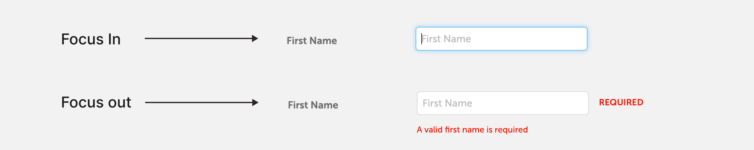
Look at these two states (focus in and out). This is a very typical issue. You have not entered any data yet and already got a validation error. Better to let users type first.
If you go through the form with the Tab key, here is what you will see.
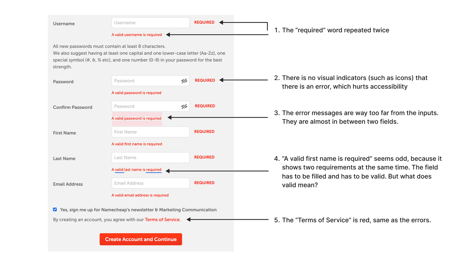
The word "required" is repeated, and there is no visual indicator like an icon. For people with color vision deficiency, it can be hard to recognize errors instantly.
Do not rely only on color. Use additional indicators.
There is also a loose coupling problem: error messages are too far from their fields, so the visual connection is weak.
The message "A valid first name is required" includes two requirements in one sentence: the field is required and the value must be valid. But "valid" is ambiguous.
Show one error at a time. It reduces cognitive load and gives users a clear next step.
Finally, the "Terms of Service" link is red, same as error color. This creates confusion. The link color should be clearly different from errors.
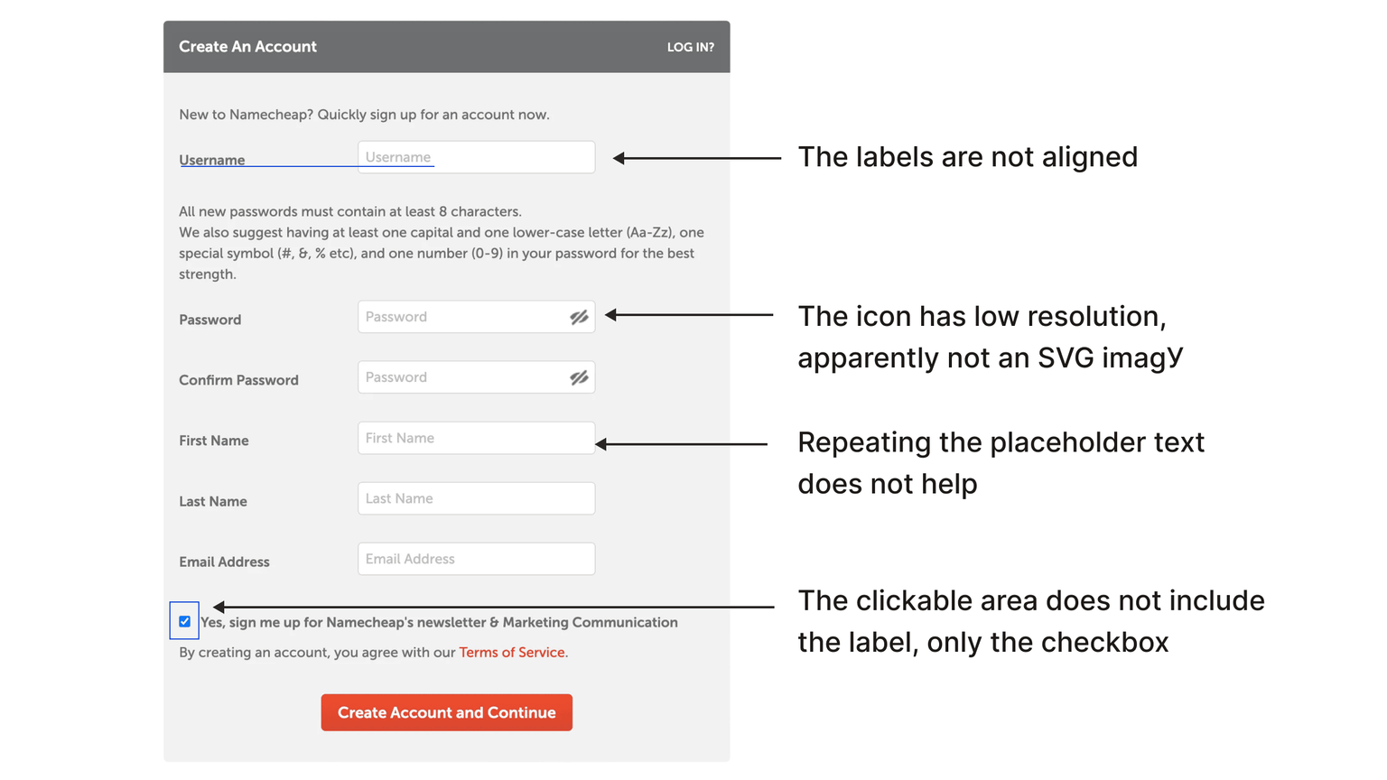
Tiny details
If you look closer, labels and placeholders are not aligned. It is a tiny detail, but many such details can make the UI feel sloppy.
The show/hide password icon is not SVG, so it has poor visual quality.
Repeating the same text in both label and placeholder adds little value.
The checkbox hit area is too small, because only the checkbox itself is clickable while the label is not.
The two-column layout is also not ideal. It may work in some cases, but often causes scanning and responsive problems. On mobile, this should usually become one column.
For one of the most important forms, there are too many fields. In many cases, email + password + social login is enough.
You can often defer email verification until the user tries to perform an important action, instead of blocking them before they even see the product.
If you need me to review your UI, I provide consulting services.