How to make text stand out from the background image and make it more readable
A common problem is placing text on images.
The challenge isn't that you can't literally place it on an image, but rather an accessibility issue: how to make sure that the text will be readable on a photo? Especially if it's uploaded by users, and you don't know in advance what it's going to look like.
In this article, I'll try to cover most of the solutions to make text accessible.
When the issue arises?
We should consider two cases:
- When you know in advance what image will be used
- When you don't know which image will be used, e.g. users upload their images
In both cases, you can face text accessibility issues. To demonstrate this, let's have a look at the following picture.

Apparently, the text is not easy to read because it has low contrast. Depending on whether we know which image is going to be used, we can apply different techniques. But first, let's define what contrast is.
What is contrast?
There are few models that define contrast. One which is widely adopted is WCAG. The latest version of WCAG (2.2) defines contrast ratio as follows:
(L1 + 0.05) / (L2 + 0.05)
Where
- L1 is the relative luminance of the lighter of the colors, and
- L2 is the relative luminance of the darker of the colors.
While this might sound intimidating, what we need to know is whether the text has good contrast or not.
However, what is a good contrast? There are two levels: AA and AAA.
AA Contrast Requirements
- For regular text and images of text, a contrast ratio of at least 4.5:1 is required.
- For large text (at least 18 point or 14 point bold) and large images of text, a lower contrast ratio of at least **3:1 ** is acceptable.
AAA Contrast Requirements
- This level requires a higher contrast ratio of at least 7:1 for normal text and images of text.
- For large text and images of text, a contrast ratio of at least 4.5:1 is required.
The easiest way to check if you meet the requirements is to use a contrast checker.
But how do we know if the text on an image meets AA/AAA requirements when the background is not static? Well, there is an awesome tool from Yaphi.
However, all this works fine if we know in advance which image we will use.
A more common scenario occurs when users upload their images, not us. I will go over all the techniques to make the text stand out more from the background image. Most of these techniques (if not all) work for both scenarios.
Adding an overlay
This is the most popular method to make text more readable. You should simply add a dark overlay above the image.
It can be done manually, if we know which image we're going to use in advance, or via CSS if the image is unknown. It might not be exactly black color with some transparency. Other colors can be used as well, if we stick to our goal to make the text accessible.
Here’s a sample Tailwind-based code snippet. The key class that does the work is brightness-50.
Essentially it applies filter: brightness(0.5)
which is widely supported.
<div class="relative">
  <img src="/img/text-on-images/sample.png" class="brightness-50" alt="">
  <div class="absolute inset-0 flex items-center justify-center">
    <div class="text-center max-w-lg text-white text-4xl">
      How to stop procrastinating and get to work?
    </div>
  </div>
</div>
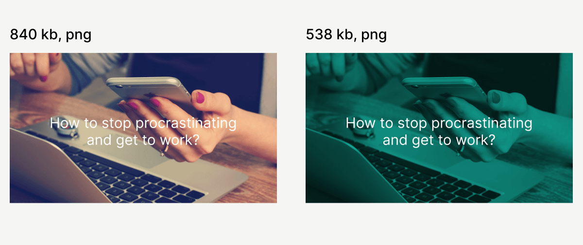
However, the overlay should not necessarily be dark.
This is a nice trick I learned from RefactoringUI. The idea is to
- Desaturate your image (set saturation to zero). So that it has only white and black colors
- Put an overlay on top of the image with your brand color (or any color you want)
- Select
multiplyas the blend mode (in Figma or another editor)
Here is a sample code for this:
<div class="relative">
  <img src="/img/text-on-images/sample.png" class="grayscale" alt=""/>
  <div class="absolute inset-0 flex items-center justify-center bg-teal-500 mix-blend-multiply"/>
  <div class="absolute inset-0 flex items-center justify-center">
    <div class="text-center max-w-lg text-white text-4xl">
      How to stop procrastinating and get to work?
    </div>
  </div>
</div>
An interesting fact that I found out is that when you de-saturate the original image, then put a color overlay and blend it, it reduces the file size.
Apparently because the image now has a narrower range of color shades, which results in the fact that there is less different type of pixels (I'm not 100% sure though, but I guess it's the reason).
Putting text in a box
Another approach is to increase contrast locally — by placing the text inside a semi-transparent box.
The box can again have different colors, be opaque, or have a blurred background. It doesn't matter as long as the text inside it is readable.
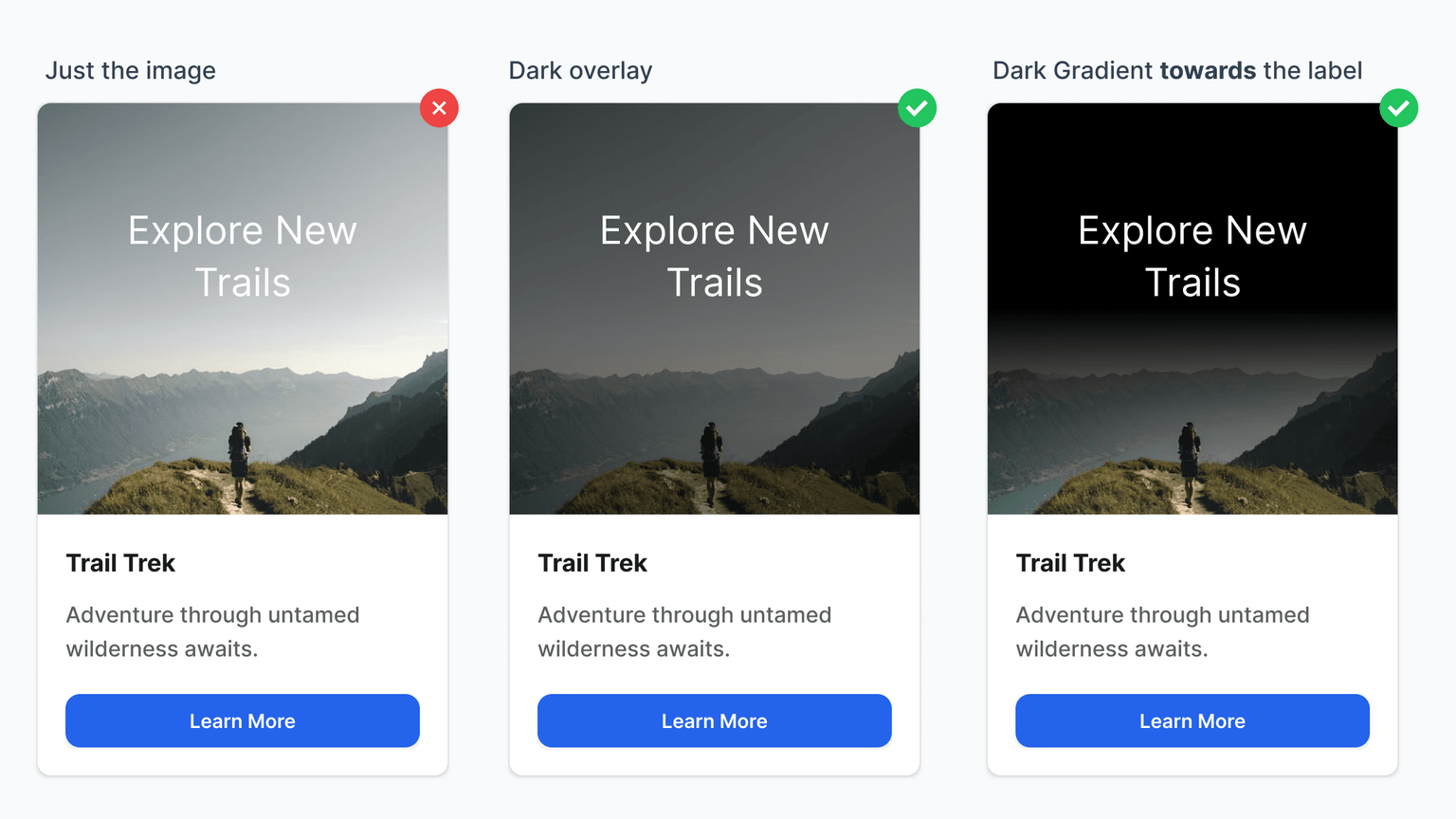
Using linear gradients
Here, I took an image from my book, as it demonstrates the difference between simply putting a dark overlay and using a linear gradient approach.
If you know where you're going to place the text, you can make a gradient that goes toward the text, while the rest of the image remains clearer.
Take a look at the third card.
WCAG might not always work
The current WCAG algorithm may not be effective in all situations. There are edge cases where it may lead to incorrect results.
The most famous one involves an orange button with black and white text on it:

There was a study comparing which button is easier to read.
You might naturally think the left button is easier to read, but the contrast checker shows that the right one meets the standard, while the left does not.
This discrepancy occurs because the current algorithm does not account for several factors. However, a new algorithm called ACPA is likely to be adopted in WCAG 3.
You can play around with the ACPA contrast checker.
Further reading
- Visibility of System Status – A foundational UX principle that reminds us to keep users informed about what’s happening in the interface, with real-life and digital examples.
- Modals and user experience - A deep dive into when modals help — and when they silently ruin UX. Includes real-world patterns, accessibility concerns, and implementation traps.
- Designing Accessible Text Over Images: Part 1 - A Smashing Magazine guide with theory, contrast rules, and design foundations for legible text over imagery.
- Designing Accessible Text Over Images: Part 2 - The second part focuses on CSS techniques, overlays, and practical implementation tips — highly recommended.